Wednesday, July 6, 2011

Photoshop Tutorial No. 008a


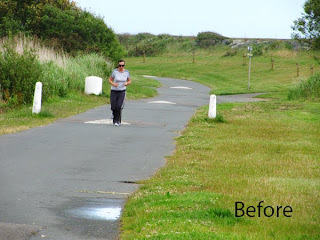
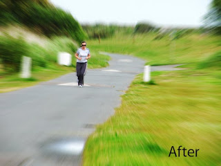
Simulating a Zoom Burst

There are many ways to portray motion in still photography, such as panning with a suitably long shutter opening and the use of a zoom lens, zoomed either in or out during the exposure. The latter technique produces some wonderful results but the major problem is in getting the technique spot on and some folk never manage to get it just right.

Enter digital capture and Photoshop where very convincing results can be obtained which are attainable without being a genius at the keyboard. The following is a step by step through the process.

01. Open your image and using any selection tool you are comfortable with, select the element of your shot which you wish to retain as appearing static. In this example I have used the lasso tool and selected the runner.

02. Try to master the technique of making a fairly tight and tidy selection. You will probably find that using a tablet and stylus is a lot more accurate than using a mouse but with practice, mousing accurately isn't too difficult. When the selection is complete go to Select..... Feather and enter a value of about 10 pixels. The exact value will probably vary from file to file but experience will guide your thinking here.

03. Now go to Select and Inverse. This will ensure that the following actions will work only on the parts of the shot which were not originally selected.

04. Next, go to Filter.... Blur.... and Radial Blur.

05. In the pop up dialogue box, click on the Zoom button and adjust the amount slider to about 20. Then click OK to accept the settings. Note that an amount of 20 is just a guide and you may feel like adjusting this yourself.

06. If the amount is obviously too little you will have to go to Edit and Undo and start the Radial Blur step again. On the other hand if it looks a bit too strong just go to Edit... Fade Radial Blur and reduce the opacity with the slider until it looks ok to your eye.

07. When happy, go to Select..... Deselect and examine your work.

08. If you find that there are strange blemishes anywhere close to the edges of your runner (in this case) you can clean these up with the clone stamp tool.

09. Re check your work and if happy, save it giving it an appropriate name and destination on your hard drive.

Thursday, April 21, 2011

Photoshop Tutorial No. 007


Straightening Buildings etc.

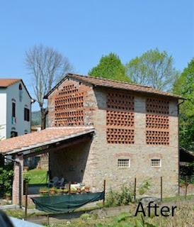
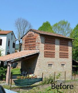
The sample photo being used here was shot by a fellow contributor to Blipfoto, a site which encourages participants to upload one photo per day and as you can see it contains some lovely sunshine and a very unusual old barn in the countryside of Tuscany, Italy. What upset my friend and which led directly to this little tutorial is the fact that the buildings and particularly the white house on the left hand side were not square on to the axis of the camera and therefore there is a pronounced lean to the right.
This is a common happening and the most obvious example would be when photographing a painting or indeed a photo. Not to fear though. With digital capture and software this is easily fixed. There are many methods but this one is easy to use and available in pretty well any version of Photoshop. How do we go about it?

1. Start off by opening up your photo and making it as big as it will go on your screen. Select the magnifying glass and click on "Fit on Screen" to achieve this.

2. Now, back off a little so that you leave yourself room in which to work. To do this, hold down the Alt key on the keyboard and you will see that your magnifying glass will change from a plus sign to a minus. Still holding Alt down, click once on the photo.

3. Now, go to Select and Select All.

4. Next, go to View...Show, and from the flyout menu tick Grid. You will now have a grid overlaying your photo. This will make it easier to align elements which should be vertical and/or horizontal in the photo with the grid for accuracy.

5. If the grid is too confusing or for that matter contains too few lines just go along to Edit...Preferences... Guides, Grid and Slices and play about with the "Gridline every so many inches" and the "Subdivisions" boxes until you have a grid which looks suitable for your purpose. You can even change the colour of the grid here too and its appearance...whether it appears as solid lines or as lines of dots. It's entirely your choice.

6. Ready for the magic? Go to Edit...Transform....Skew.

7. You will see 8 small boxes, or handles, appear on your photo. One at each corner and one at the midpoints of each of the four sides.

8. Find a vertical in your shot, which is obviously off and select a corner handle nearby. In the case of our example here I used the slanting wall of the white house and the top left handle.

9. Click on the handle with the mouse and holding the click down, drag the handle, in this case, to the left until the corner of the house lines up as best as possible with the nearest vertical grid line. It doesn't of course have to be touching the grid line, just judge it by eye.

10. Now check carefully all over your image, looking for any verticals or horizontals which you may have upset with your first move. If there are any, tweak them in similar fashion until you have achieved what you want.

11. When you have time to practice, check out what happens when you drag a corner handle vertically rather than horizontally and for a bit of a surprise practise sliding the handles on the perimeters up/down or left/right depending on which outer line they are on.

12. When you are happy, hit the Enter key to accept the changes. Go to Select...Deselect and then to View...Show...Grid and untick the Grid box.

13. Before you save your newly corrected image just check that you haven't left yourself with any bits of stray white most likely in the corners. If you have, you will need to crop inside these to remove them or if you are feeling like fun try cloning them out instead. You are now ready to save your new masterpiece.

Monday, April 11, 2011

Photoshop Tutorial No. 006


Sharpening

There have been a couple of requests recently for a tutorial on the matter of sharpening in Photoshop, so in an effort to address these I have put these few thoughts together and trust that they may be of some assistance in the furtherance of your photography.

At the outset I should point out that although files coming off a digital camera nearly always require some degree of sharpening, the use of the Unsharp Mask will not automatically turn a sow's ear into a silk purse. If for instance, you have a photo which is suffering from camera shake or even worse, from elements which are plain out of focus, there will be little you can do to remedy the situation. Sharpening can of course be beefed up in the camera but I don't advise this since you cannot see what the camera's processor is doing and you don't have any degree of fine control over the results. The best way out is to leave the in camera sharpening set at its default setting and look after the fine tuning using the larger screen of your laptop or PC.

The best method of sharpening will vary from photographer to photographer since we all have our own way of working, but the method I am detailing here is what works for me and is the result of more than ten years of experimentation and practice.

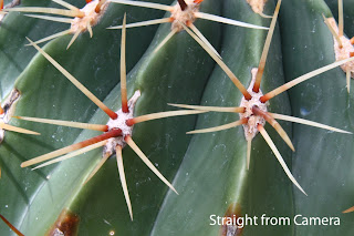
1. When you open up your image into Photoshop don't be at all surprised if it looks a little bit softer than you imagined. This is very common and doesn't necessarily mean that there is something wrong with your camera or your shooting technique. The above is a close up of a cactus which may demonstrate the point. By double clicking on the image you will open it in a separate window where examination may be easier.

2. To sharpen the opening image you should use the Unsharp Mask, known as USM. This you can access via, Filter...Sharpen.....Unsharp Mask. Once you get in here you will notice that you have three sliders, a preview box which when ticked will show you the result of moving the sliders, in real time on your open image. You will also see a preview window containing part of your image. Click in this and the preview will revert to the original, unclick and you will see the changes here as well as in your main image. There is a zoom control here too so that you can zoom in or out using the plus or the minus symbols. If you click into the preview window, hold the mouse button down and move the mouse you will see that you can scroll around your image. As an alternative you can click once into your main image at any point which interests you and this point will appear in the preview window.

Now, a word about the sliders.

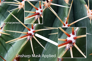
Amount. This, as the name implies, controls the intensity of the sharpening. The higher the figure entered here, the greater will be the amount of sharpening applied. Do not assume however that bigger is better. If you apply too high a figure here you will for sure begin to see nasty sharpening artefacts and haloes appearing around objects in your shot. In the shot entitled "Unsharp Mask Applied" you will hopefully see the effects I am talking about. The lower insert box has had an amount of 100% applied which is the amount I find works best for me. One further thing though. When I am sharpening files off my compact cameras which have tiny image sensors and a degree of built in sharpening applied by the camera(which cannot be overriden), I find that 50% is enough and avoids nasty haloes.

Radius. This slider controls the width of the sharpening effect and you should go easy on it. My personal preference is for a setting of 1.

Threshold. The Threshld slider controls which pixels will be sharpened, based on how much they deviate in brightness form their neighbours. Again you should be wary of pushing this slider too far and in fact my practice is to leave it at 0.

3. You are now done...... except for this final little known tweak, not often used and only used by myself on those images which sharpen up ALMOST right but not quite. This is the use of the High Pass Filter which when used carefully can give your image just that small edge which sets it above the rest. Here's how it goes.

NOTE : This step is optional and should not form part of your usual workflow. It is literally for extracting the last drop of juice from those images which require it.

First, having gone as far as this tutorial so far, i.e. you have the USM applied, duplicate the layer. Layer...Duplicate Layer

Second, go to Filter...Other... High Pass. A very similar dialogue box to the USM one will open up. Horror of horrors, your image has gone grey. Take my word for it, all is ok. It's supposed to do that. Set the radius to 2. Don't ask me why. It would take too long to explain. Just don't be tempted to set it any higher unless you want to experiment.

Third. Open up your layers pallete...Window...Layers and you will see that you have two layers. The top one will be active. Click on the small arrow where it says "Normal"(this appears right under where it says"layers" and just to the left of "opacity") and pick "Overlay" instead from the drop down list. See that! Your image is back in colour. Now examine it carefully. If the effect looks a bit too harsh click on the arrow beside the word "Opacity" in the Layers Pallete and move the slider back until your image looks good.

Fourth and last flatten the image.... Layer....Flatten Image and save your work.

I have tried to place the illustrations in between the sections of this article but since I know rather more about Photoshop than I do about Blogger, I fear that they may all appear at the top. My apologies if this is the case. Hope it doesn't undermine your viewing pleasure. Best of luck. If you get your head around all of this and apply it as a matter of normal practice, you should see the benefits accruing in your photo output. In any case have fun!!

Saturday, March 5, 2011

How To Do It No. 001


Cross Polarisation

Some Theory

1. Ordinary light can be regarded as travelling in waves that vibrate in all directions at right angles to the direction along which the light is travelling.

2. Certain crystals will only allow electro-magnetic waves to pass through them if they are vibrating in one particular plane.

3. So, any light that passes through the crystal, emerges vibrating in the one plane along which the crystal is transparent.

4. Light which thus has its vibration restricted to a single plane is said to be plane polarised.

5. In this technique the object is placed between two polarising filters. By crossing one of the filters (in our case the one on the camera lens) we would normally stop all light from coming through.

6. If however the object affects the polarisation of the light it will become visible from behind the filters. Here the photo-elastic stresses in the clear plastic materials, which do affect such polarisation, become visible and it is these we are trying to record.

The Practice

1. I started off with a light box. Normally used for viewing transparencies or negatives, you can obtain one for £29.99 from www.digitaldepot.co.uk. You could of course use a sheet of glass lit fron beneath with a diffused light but the big advantage of a lightbox is that its built in light source is daylight balanced.

2. Place a polarising filter, or better still if you can afford it, a sheet of polarising material (available as A4 or 10"x8") on top of the light box.

3. On top of the filter, place the plastic objects to be photographed.

4. With the second polariser fitted on the camera lens you will notice that as you rotate this filter, the cross polarisation effect will become visible. At a certain point in the rotation you will notice that the white light coming from the light box will go black, proving point 5 above.

5. At the same time though the stressed portions of the plastic objects will become visible as a rainbow of colour patterns.

6. Now is the time to shoot. I find that using manual exposure works best, with a stop or so of underexposure dialled in. This makes the blacks really black and the rainbow colours really rich and vibrant. Autofocus generally works well but if your system begins to hunt for a focus point you can always switch to manual focus instead. Because the lightbox delivers light the equivalent of daylight you will find that Auto White Balance will do just fine but you may need to switch to the tungsten setting if you are using the sheet of glass and artificial lighting set up.

Needs

One article made of clear extruded plastic, two regular polarising filters or one regular and one sheet of polarising material, one lightbox, one camera and a little bit of inspiration.


Wednesday, January 26, 2011

Photoshop Tutorial No. 005


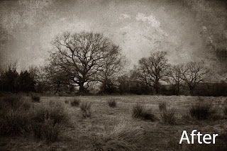
Several folk have been asking me how I produce shots with textures applied so as to simulate an old and tattered look such as the type of shot one might find in a shoebox in the attic, or in Granny's ancient photo album, so here goes.
First off, you will need to use photo editing software which allows you to work on multiple layers. Adobe Photoshop of course is the industry standard but an expensive piece of software. Almost as good is Adobe's consumer version, Photoshop Elements, now up to version 9 but the earlier versions work just fine too. I understand that The Gimp will also allow you to use layers. It is free for download although I haven't ever used it on a layered image, so I can't at this point include a tutorial based around it. Most of the other free packages do not allow the use of layers and so, are not suitable. For the present purpose, I am going to concentrate on Adobe's packages.

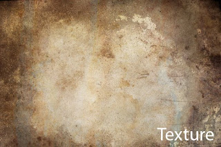
Secondly, you will need a texture (sometimes called a texture screen) to use. Back in the days of the wet darkroom and film, we used to be able to buy ready made screens for the purpose. They were just like a negative and in use were sandwiched with the negative on the roll of film and the two printed together onto the paper. With digital however, you will need to either download some textures off the net, or better still, shoot your own. I am forever shooting textured patterns for this very purpose and keep them all together in a special folder on the hard drive for instant access. The one I am using here was originally a baking tray which met with an accident in the oven. Removed in a rather charred state it was thrown out into the back yard, where it remains to this day. A while back though, after it had taken on a strange and rusted look, I photographed it, to add to my collection of textures.
Right then, with our texture lurking on the hard drive and a suitable image to begin work on, where do we go next? Here we go...

1. Open up the start image and convert it to black and white. The easiest way to do this is to simply go to Image... Adjustments... Desaturate. This is not necessarily the best way but for our purposes it will do fine.

2. Now open up your texture and perform the same desaturation routine on it.

3. Using the Move Tool (4 headed arrow symbol), click into the texture shot which should have been moved aside a bit if needs be so that you can see your start image and drag the texture onto the start image. The texture shot itself can now be closed down.

4. Resize the texture shot so that it fits exactly on top of your start image. Go to Edit...Transform... Free Transform and drag on a corner handle to increase or decrease the size of the texture shot. When you have it so that it is smaller than your start image, hit the enter key to accept what resizing you have done so far and drag it into the top left corner of the start image. Now go back to the free transform as before and drag the bottom right corner of the texture out until it meets the corresponding corner of your starter and again hit the Enter key.

5. You will now see only the texture, which is completely obscuring the start image. If your layers palette is not already open, go to, Window... Layers to bring it up and you will see that you now have a two layered image. The background layer will be your start image and Layer1 will be your texture. Make sure Layer1 is active by just clicking once on its name so that the background to the name turns blue. The blue layer is always the active one. Note the word "normal" at the top of the layers palette. Click on the downward pointing arrow to its right and you will open a long list of options. These are worth experimenting with as they blend the active layer with the one below in different manners. For the moment just click on Multiply.

6. Now for the clever bit. You are going to erase parts of the texture to reveal more of the background beneath it. Again with Layer1 active, select the Eraser tool. Look up above where the tool options are displayed. Where it says Brush, click the downward arrow and pull the hardness slider most of the way to the left. This gives it a nice soft edge. Move the Master Diameter slider about half way along its scale. This alters the size of the tool tip. As you work you can increase the size by hitting the right square bracket key... this one ] a few times , or decrease the size with the left square bracket... this one [ Now here is the big secret. Where it says Opacity in the options, click on the arrow to its right and this will reveal another slider. Slide this back to about 10%. Less for some work, more for others but 10 is a good starting point. Now, erase away the texture to reveal as much of the background layer as you wish. Take it easy. Speed will come with experience. For now have patience. If the erasure is too weak or too slow you can increase the opacity but be careful or you may take out too much.

7. Now that you are happy, go to... Layer...Flatten Image. If you now look at your layers palette you will see that you now have only one layer again.

8. Time to spruce the image up if it is looking a bit flat. You can use either levels or curves to do this. I always use curves. Image... Adjustments...Curves. You will see that the tonal curve of the image is represented as a straight line. Try experimenting by pulling the line down just a tiny amount at the first intersection of the graph in the lower left corner and by pushing the line up, again just a small amount, somewhere near the centre. It's hard to be exact about this as all images are different and you may have one which doesn't need this step at all.

9. Now we add some sepia. Go to Image...Adjustments...Colour Balance. Three sliders will come up. Push the top one toward red to the tune of about +15 and pull the bottom one towards yellow to read about +25. These are only starter values and the exact amounts for your image will depend on what you like the look of.

10. Nearly done. Repeat Step8 if the image is looking a bit flat or light or dark, until it looks good.

11. Finished at last! Go to File... Save As and choose a name and location for your new masterpiece. Don't forget when saving a JPEG file, ALWAYS choose a compression value of 12 when asked, for a file you intend to keep. The lower values will compress the file size for easier transmission over the net, but will rob you of the quality you have just painstakingly laboured to achieve.

As long as I haven't left something out you now have a shot worthy of framing.
Finally, this may look frightening at first glance, but after doing two or three you will discover that it is really quite an easy task and great fun too. Best of luck with it.
Friday, January 7, 2011

Photoshop Tutorial No. 004


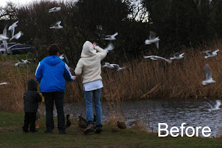
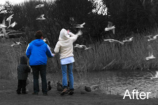
I often get asked about "Colour Popping" which is a method of producing an image which while converted to black and white, contains some elements of colour within it. Given an appropriate starter file it can be a good technique to master and with which to throw emphasis on a particular item or items within the shot. As usual in Photoshop, there are several ways to achieve the same end and I may come back to this subject with another method some day, but for the moment, this is probably the simplest method of all. One thing to remember though is that using this method demands that you be accurate in your work. When you use the eraser as outlined try to get it right first go. If you carry on, after making an error it is often not possible to retrace your steps and you will mostly have to start all over again. This technique will work with every version of Photoshop or Photoshop Elements that I have ever used and should be easily possible with any other piece of software, so long as it allows you to work with multiple layers, in this case just two. So, here we go :

1. Open your original photo.

2. Go to, Layer... Duplicate Layer and click OK in the resultant dialogue box.

3. Ensure the duplicate layer is active and convert it to black and white by whichever method you prefer. The simplest way is to go to, Image....Adjustments....Desaturate.

4. Select the eraser tool and choosing a reasonably soft edge while working on the duplicate layer, gradually erase away the black and white image where you wish the colour to show through. This will allow the colour of the original file to become visible.

Tip : You will need to decrease the size of the eraser in order to work into small areas. Use the square bracket keys to increase/decrease the size of the eraser. The square bracket keys are these guys [ , and ] and are found over beside the ENTER key on the keyboard. Use [ to decrease the tool size and ] to increase it. Repeated tapping of the appropriate key will resize the tool quickly.

5. When you are satisfied with your work, flatten the file down to a single layer bu going to, Layer...Flatten Image.

6. Finally save your image with a new name in order to preserve your original file. Do this by going to File... Save As and typing in a new name.

Happy Hunting!

Monday, November 29, 2010

Photoshop Tutorial No. 003


Shadow Diffusion

In the far off days before the dawn of digital photography, photographers were forced to use that old fashioned medium called film. The production of prints from this strange medium required the use of a darkroom, a secret space where the photographer practiced what were known as the "black arts". Every so often a cry of "Eureka!" would emanate from within the hallowed space and the world would understand that another great masterpiece had just been born. It wasn't unusual for the photographer/printer to place a mesh such as a ladies nylon stocking over the enlarger lens in order to diffuse the highlights. Less commom though was the practice of using a black nylon over the camera lens in order to diffuse the shadows rather than the highlights. Thankfully, we now have an easier way to do the same job in the comfort of our own living room and using our computer. Here's how to, using Photoshop.

1. Open your image and immediately duplicate the background

2. With the duplicate layer highlighted, go to, Image....Adjustments....Invert

3. Now, go to, Filter...Distort.... Diffuse Glow

Try figures of 4, 5 and 15 in the resultant dialogue box

4. Now, go back again to, Image....Adjustments....Invert

5. This has now reverted your image back to a positive

6. If necessary, reduce the opacity of the duplicate layer to suit your own taste.

7. Now, flatten your image and save

Note that in your resultant image the shadows will have diffused or spread into the highlights